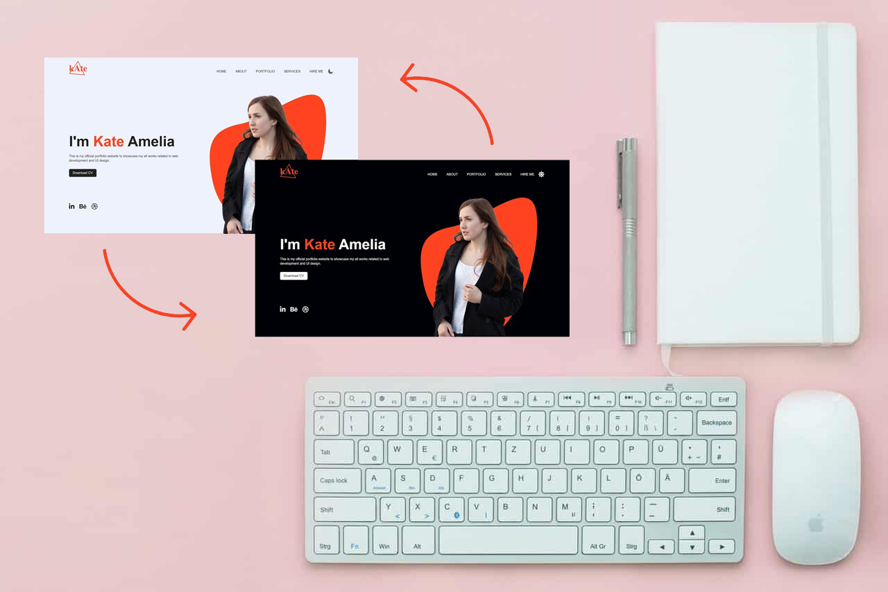
Dark Mode Website Designs: Enhancing User Experience with a Stylish Twist
Dark mode has become a popular trend in website and app design, offering a sleek and eye-catching alternative to traditional light-themed interfaces. In this blog, we’ll explore the benefits of dark mode designs, discuss the impact on user experience, and provide tips for implementing an effective dark mode on your website.
The Rise of Dark Mode:
Dark mode has gained traction due to its aesthetic appeal and potential benefits for user experience. This design choice flips the traditional color scheme, replacing bright backgrounds with darker tones and using lighter text and elements for contrast. With the increasing prevalence of OLED screens and user preferences for reduced eye strain, dark mode has become a sought-after feature across various platforms.
Enhancing Readability and Reducing Eye Strain:
Dark mode can significantly improve readability, especially in low-light conditions. The contrast between light text and dark backgrounds reduces eye strain by minimizing the amount of light emitted by screens. However, it’s important to carefully choose the color palette to ensure sufficient contrast and legibility. Dark grays, deep blues, or subtle hues work well, while avoiding colors that make text harder to read.
Creating a Distinctive and Modern Look:
Implementing dark mode offers a contemporary and stylish aesthetic, making your website stand out from the crowd. The dark mode website design allows vibrant colors, images, and illustrations to pop, creating a visually engaging experience. However, it’s essential to maintain consistency in your design and branding, ensuring that dark mode harmonizes with the overall user interface and remains intuitive to navigate.
Energy Efficiency and Battery Life:
Dark mode designs can contribute to energy efficiency, particularly on devices with OLED or AMOLED screens. Since black pixels require less power to illuminate, using dark backgrounds can lead to lower battery consumption. This benefit is particularly relevant for mobile devices, where users prioritize longer battery life. By incorporating dark mode, you can offer a more efficient and sustainable user experience.
Implementing Dark Mode Effectively:
When implementing dark mode, consider providing users with a toggle switch to easily switch between light and dark themes. This allows users to choose their preferred mode based on their environment or personal preferences. Additionally, ensure that the user interface remains intuitive and that text and elements have sufficient contrast for readability. Test your design across various devices and monitor user feedback to make iterative improvements.
Dark mode designs have become an increasingly popular trend in web and app development, offering a visually striking and user-friendly alternative to traditional light-themed interfaces. By leveraging the benefits of dark mode, such as enhanced readability, reduced eye strain, and energy efficiency, you can create a modern and engaging user experience that keeps your website on the cutting edge.


